Find That Feeling Called Home.
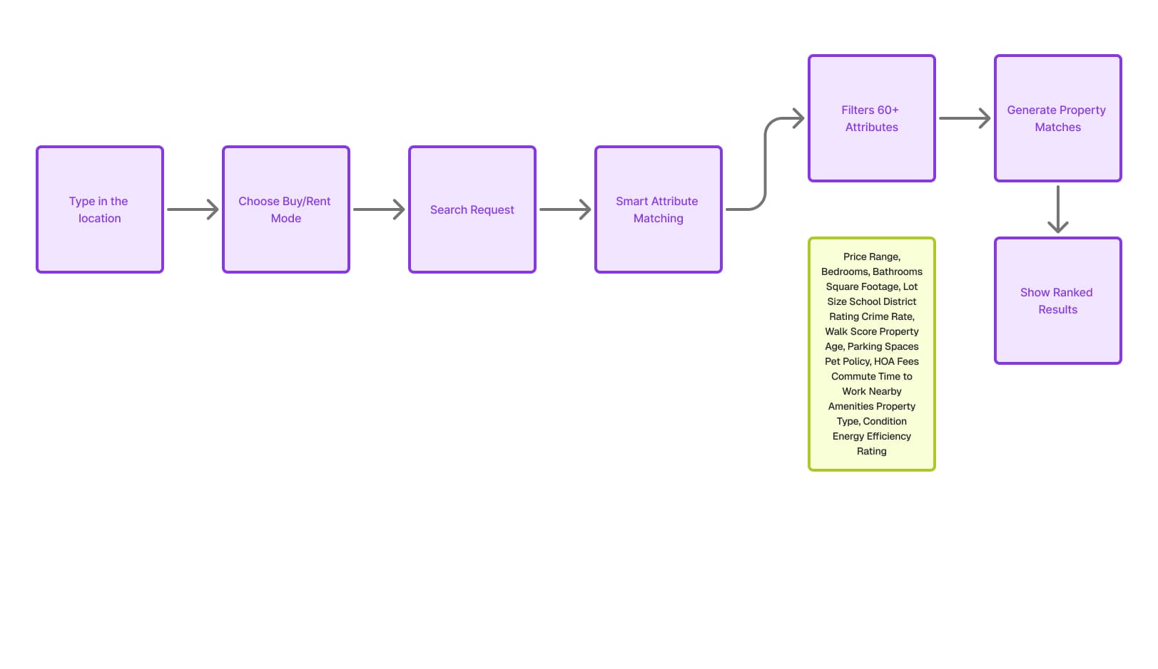
Real estate search has a design problem. Platforms hand buyers 60+ filters and expect them to self-configure the most important purchase of their lives. Most people don't know what Walk Score means — and the interface never taught them. Spaces Homes was designed around the opposite: describe what home feels like, and the UI does the rest.
Client
Homespaces
Industry
Real Estate & AI
Services
- Product Design
- UX Design
- AI Interface Design
Status
Shipped
60+
Life-quality factors surfaced through one intuitive search bar
95%
User satisfaction rate in closed beta
Natural
Language-first — describe home, the UI finds it
Real estate search has a design problem. Platforms hand buyers 60+ filters and expect them to self-configure the most important purchase of their lives. Most people don't know what Walk Score means. Most people don't manually add commute time as a filter. The interface assumed expertise the buyer never had.
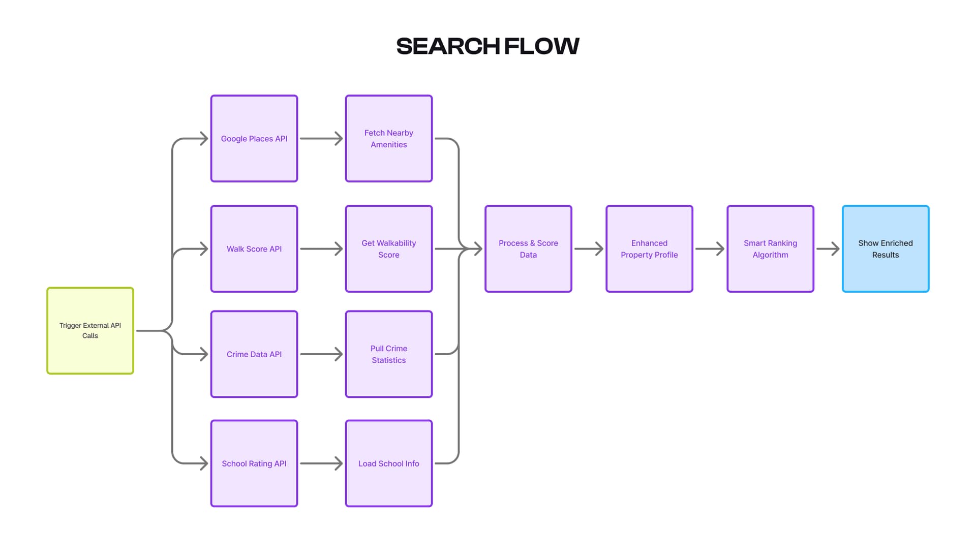
Spaces Homes was designed around the opposite premise: lead with intent, not configuration. A buyer types 'quiet neighbourhood, good schools, easy highway access' and the UI translates that into a ranked, enriched results set — with every relevant signal surfaced contextually on the property card, not buried in a detail page.
Natural Language Search Bar
Designed a search experience that accepts plain language — full sentences, vibes, lifestyle descriptions — and surfaces ranked, enriched results without exposing the complexity underneath.
Contextual Property Cards
Result cards surface only the signals relevant to that specific query. Searched near schools? School rating leads. Mentioned commute? Drive time leads. The card adapts to the search, not the other way around.
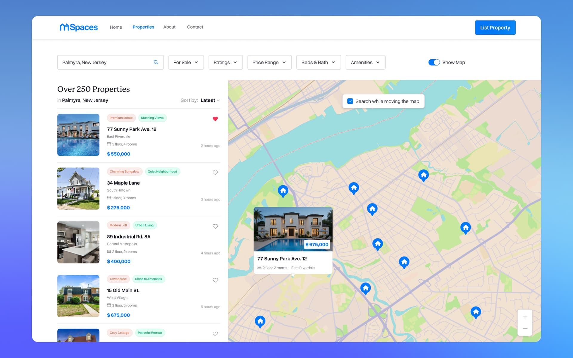
Interactive Map View
A split search-and-map layout that lets buyers triangulate neighbourhood feel with data — pins showing match score, not just price. The map is a search tool, not a decoration.
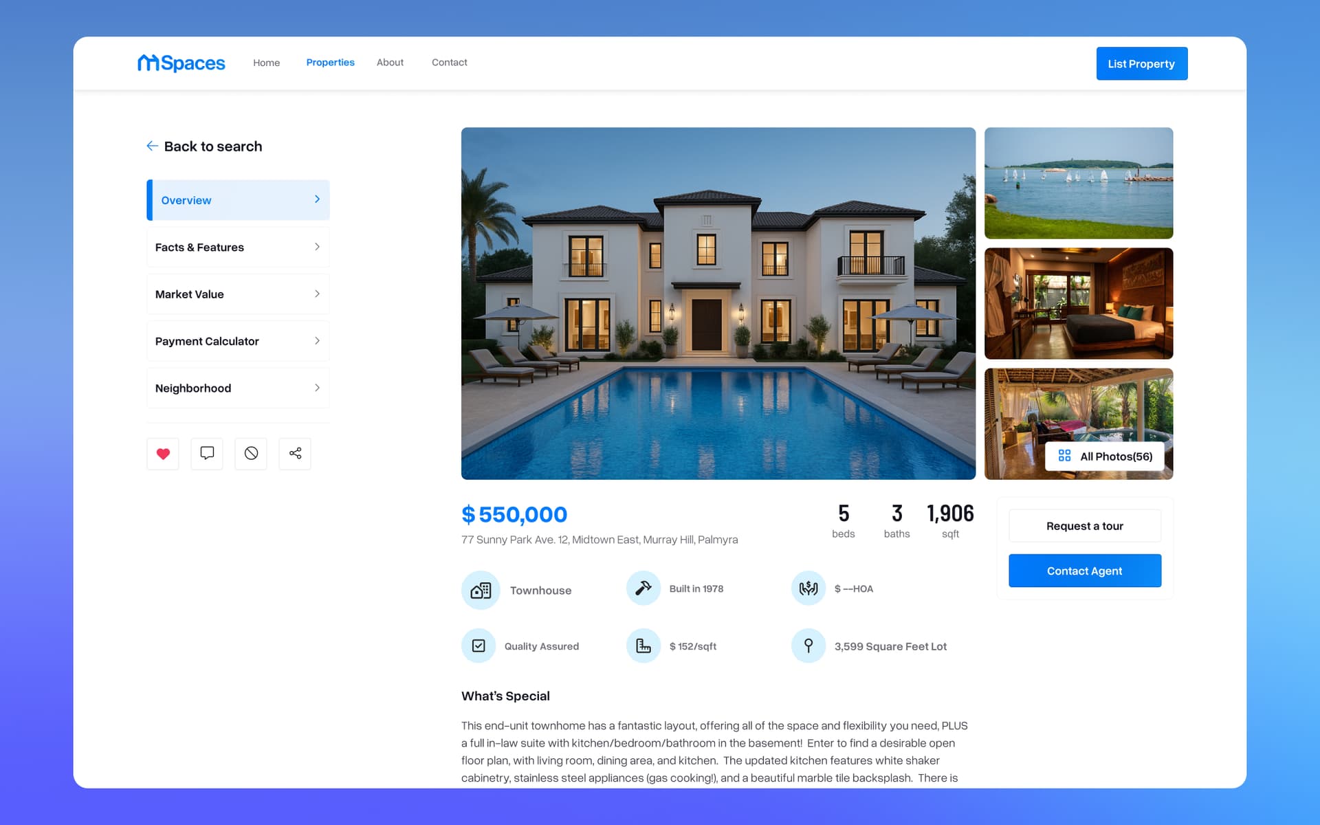
Property Detail Page
Designed around the buyer's decision, not the agent's checklist. Lead content answers the questions the buyer already asked in their search, followed by supporting detail and a direct path to the listing agent.
Agent Profile & Trust Layer
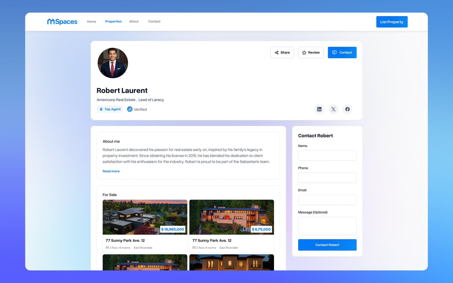
Agent profiles designed to build confidence quickly — verified sales history, neighbourhood expertise, and a contact form that carries context from the search into the conversation.
Filter & Refinement System
When buyers want to go deeper, a refinement panel surfaces the 60+ signals as readable filters — not dropdowns. Designed so discovery and precision can coexist without friction.
Spaces Homes's tokens, type scale, and rules as a design.md — drop it into Cursor, Claude Code, or v0.
Search results ranked by life-quality match — commute times, school ratings, and neighbourhood feel surfaced at a glance.
The Search Interface: Intent Over Configuration
The central UX challenge was making a complex matching engine feel like a conversation. I designed the search bar to accept natural language — full sentences, partial descriptions, neighbourhood vibes — and surface enriched results without exposing the 60+ factor model underneath. Result cards show the signals that matter for that specific query (commute time if the user mentioned an office, school rating if they mentioned kids) rather than dumping every data point on every card. The interface adapts to the search, not the other way around.
Property Detail & Agent Flow
Once a buyer finds a match, the property detail view needed to deliver confidence — not just information. I designed the detail page around the buyer's decision, not the listing agent's checklist: the lead content answers the questions the buyer already asked in their search query, followed by supporting detail, photos, and a direct path to the agent. The agent profile was designed to build trust quickly: verified sales history, neighbourhood expertise, and a contact form that carries context from the search query into the conversation.
"The design Herry and Manu built perfectly matched what our users needed — the search experience felt intuitive from day one, and the satisfaction numbers in our closed beta proved it."
Next Project